CAVAILLES
From tradition to timelessness
The challenge
Almost 100 years after it was founded, the expert brand for sensitive skin entrusted us for an ambitious relaunch. Newly dedicated to « skin regeneration », the brand wished to enhance the timelessness of its expertise.
Our solution
We have drawn from the brand’s history to better project it into the future.
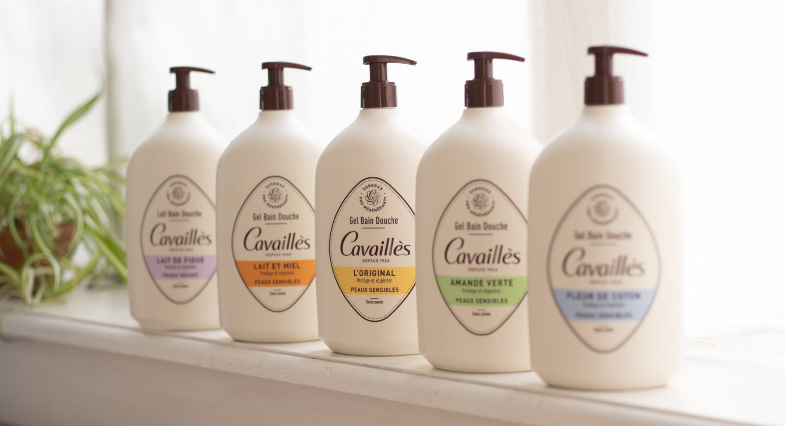
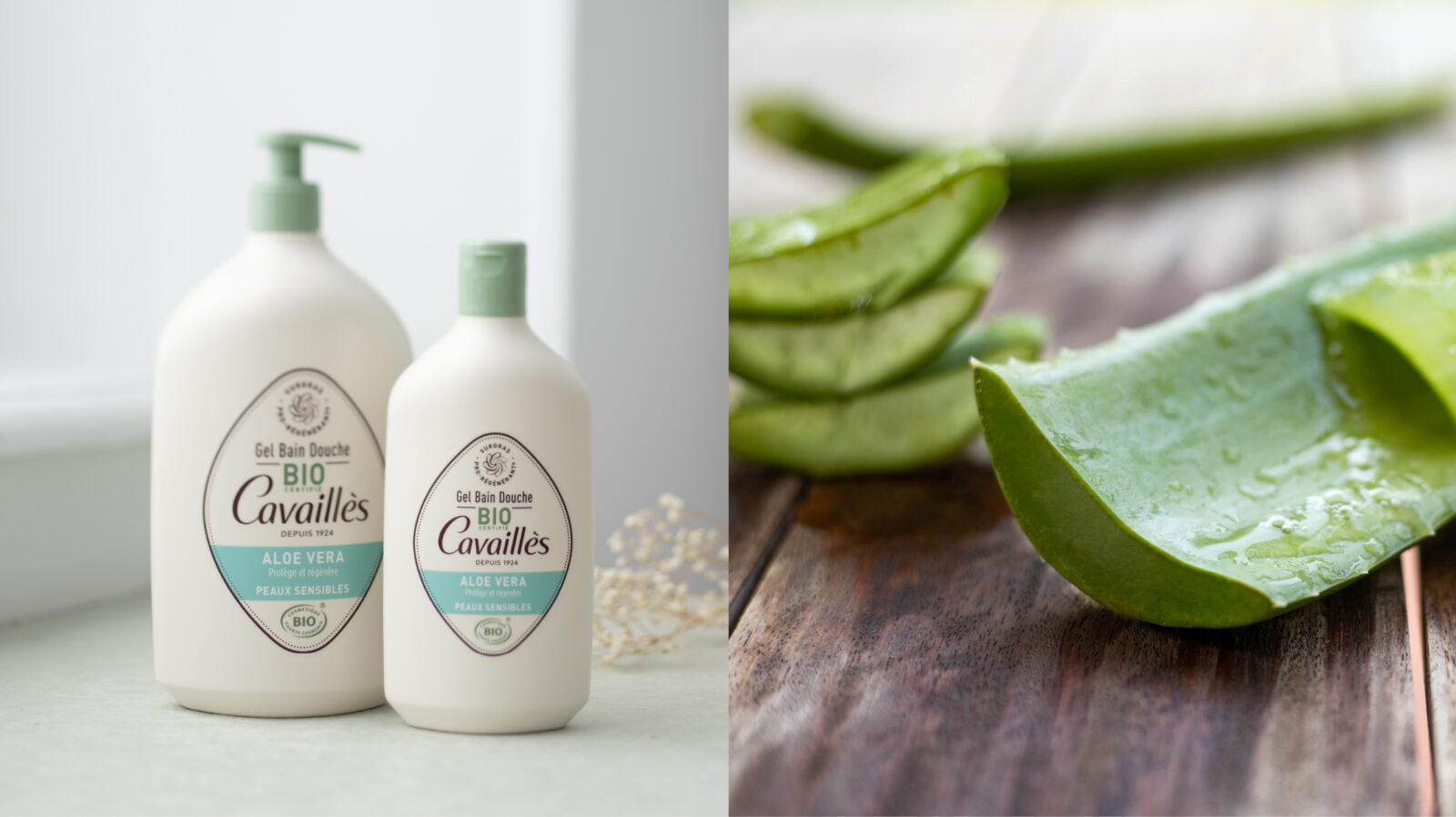
A new monogram, symbolising the unique active principle of regenerating oil-enriched formula, at the heart of all the brand’s products, crowns the founder’s name for a revamped brand identity.
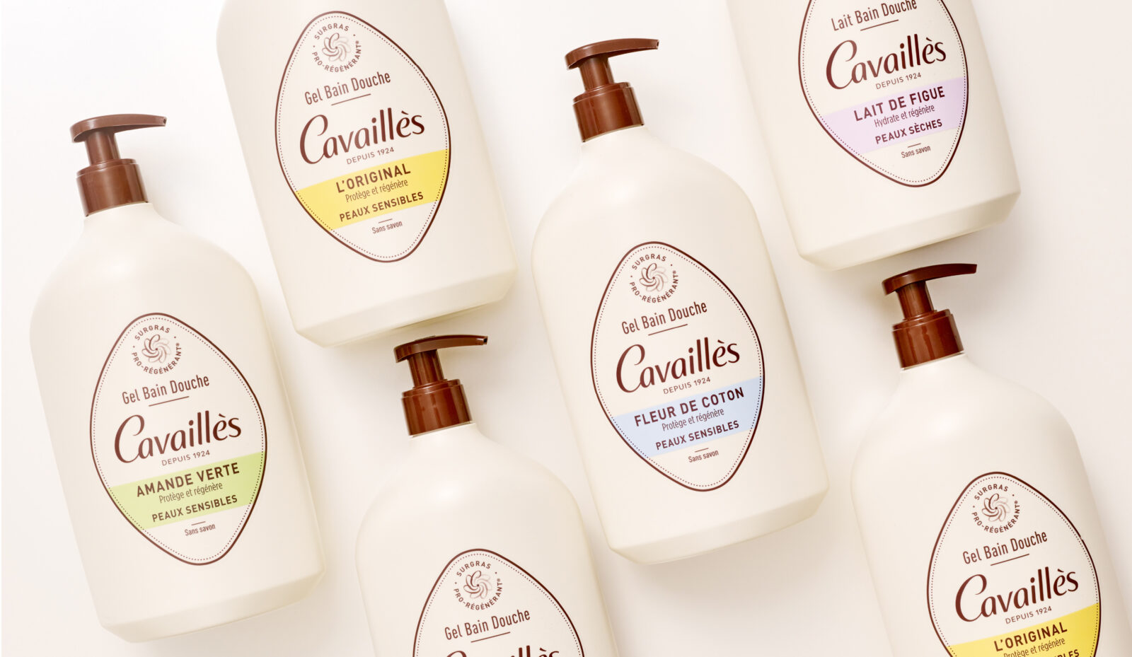
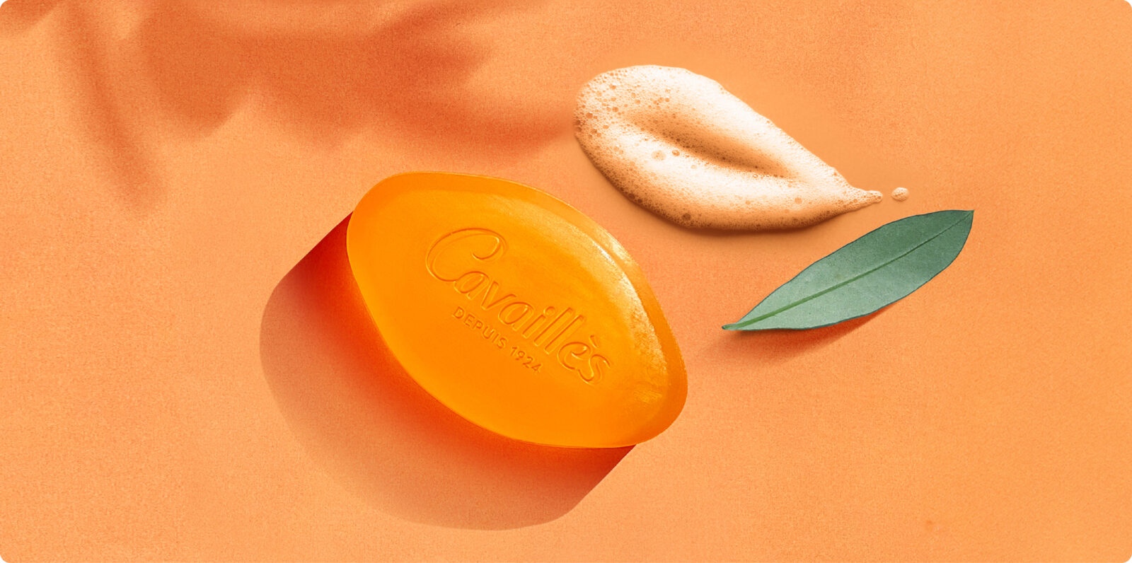
The revised visual identity system also includes a new graphic structure and a new 3D design inspired by the iconic “calisson” shape of Cavaillès’ historic soap.
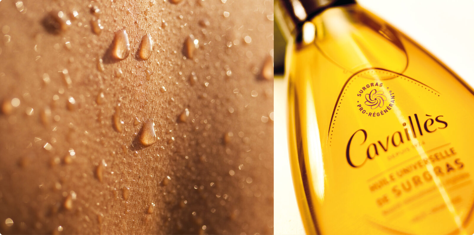
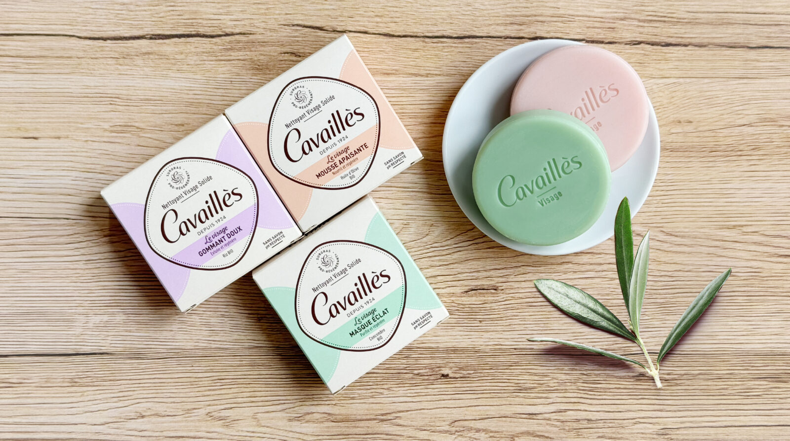
A revisited territory, combining heritage inspiration and contemporary sobriety, which also extends to innovations such as universal surgras oil and solid cosmetics.
Blackbox input
A design lab phase to test the different packaging options on shelves with consumers and, through an iterative process, to inform the choice of a final route.
« Blackandgold agency worked with us on the strategic revamp of our historic Cavaillès brand. The team helped us with the initial strategic thinking, the development of strong, ownable creative ideas and packaging and structural design. I particularly appreciated blackandgold’s spirit of collaboration and strong strategic input at every stage of the project. The entire new range is now available in pharmacies and is actively contributing to the recruitment of new consumers and the successful relaunch of Cavaillès. »
